McAfee Security Home Screen Redesign
McAfee Security Home Screen Redesign
Redesign the home screen of the McAfee Security app to emphasize its security benefits and boost user engagement, thereby increasing the rate of paid users.
Redesign the home screen of the McAfee Security app to emphasize its security benefits and boost user engagement, thereby increasing the rate of paid users.
Role
Lead UX designer working collaboratively with other designers, UX researcher, content writer, illustrator and product managers.
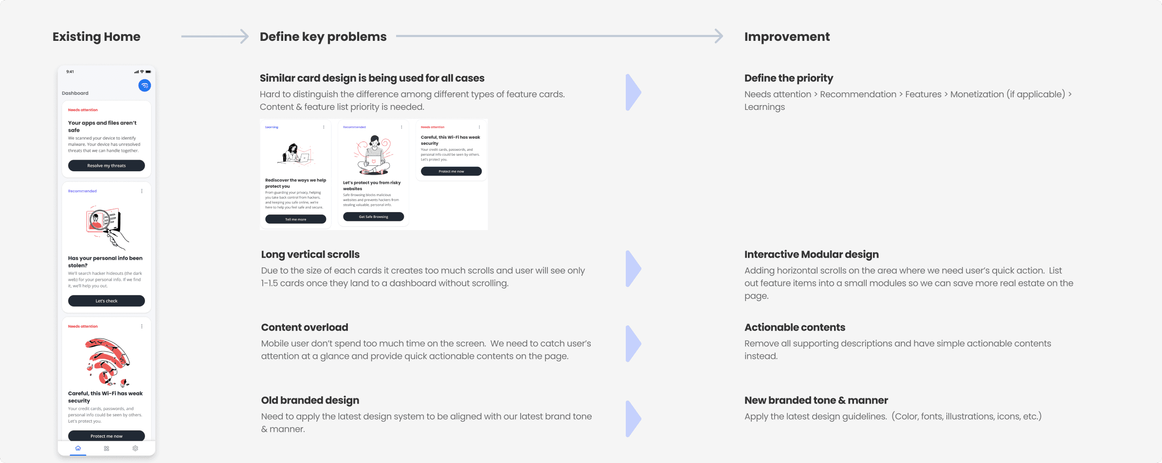
What was the problem of the existing home screen?
External
Feedbacks from 10 participants who used the app / In depth interview
Most users felt overwhelmed by too much information on the home screen and were unclear where to begin. They also struggled to differentiate the card contents within the security category, as they seemed too similar.
Internal
Feedbacks from stakeholders
Stakeholders emphasized the importance of promptly displaying how McAfee ensured user safety, making it easy for users to recognize and understand the key security measures vital for their protection
McAfee Security Home Screen Redesign
Redesign the home screen of the McAfee Security app to emphasize its security benefits and boost user engagement, thereby increasing the rate of paid users.
Role
Lead UX designer working collaboratively with other designers, UX researcher, content writer, illustrator and product managers.
What was the problem of the existing home screen?
External
Feedbacks from 10 participants who used the app / In depth interview
Most users felt overwhelmed by too much information on the home screen and were unclear where to begin. They also struggled to differentiate the card contents within the security category, as they seemed too similar.
Internal
Feedbacks from stakeholders
Stakeholders emphasized the importance of promptly displaying how McAfee ensured user safety, making it easy for users to recognize and understand the key security measures vital for their protection
McAfee Security Home Screen Redesign
Redesign the home screen of the McAfee Security app to emphasize its security benefits and boost user engagement, thereby increasing the rate of paid users.
What could have been the reason for those problems?
What could have been the reason for those problems?
What could have been the reason for those problems?
Predicted the reasons behind issues that users experienced and ideated on how to improve them.
Predicted the reasons behind issues that users experienced and ideated on how to improve them.
Structuring Information and Rapid Visualization
Structuring Information and Rapid Visualization
Structuring Information and Rapid Visualization
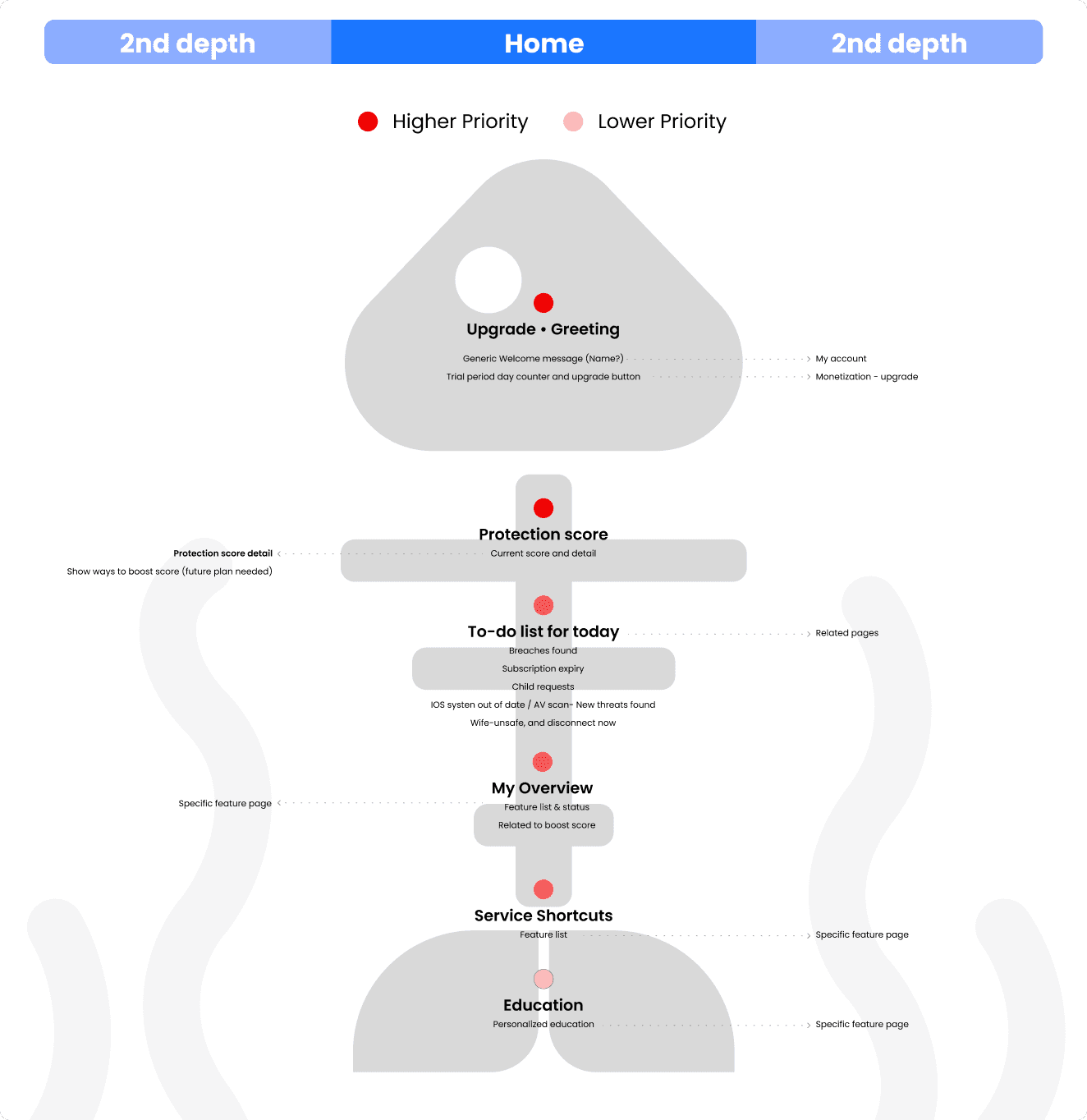
Based on the assumptions from the previous step, Defined an information architecture assumed to be the optimal solution for users, and rapidly visualized it through wireframes to test the solution
Based on the assumptions from the previous step, Defined an information architecture assumed to be the optimal solution for users, and rapidly visualized it through wireframes to test the solution
INFORMATION ARCHITECTURE
INFORMATION ARCHITECTURE
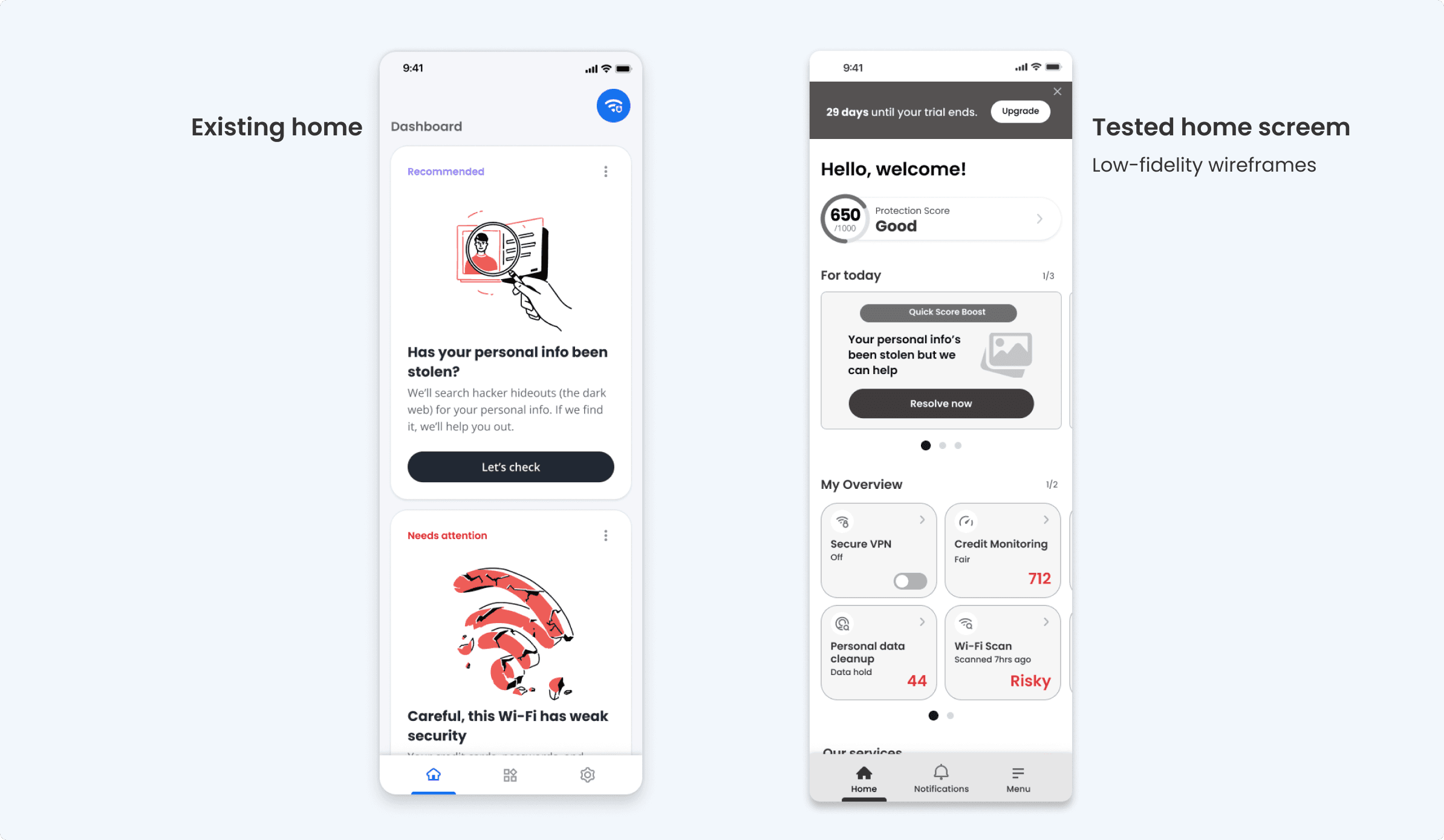
Low-fidelity wireframes
Low-fidelity wireframes
User Testing
User Testing
User Testing
In-depth Interview : A moderated study to assess how well participants understand and actively engage in tasks, and their recognition of the value of security features in wireframes prototypes.
In-depth Interview : A moderated study to assess how well participants understand and actively engage in tasks, and their recognition of the value of security features in wireframes prototypes.
Participants
Participants
12 USA participants recruited by Userzoom / Age range : 28 ~50 / Tech savvy : Novice (2), Intermediate (8), Advanced (2)
12 USA participants recruited by Userzoom / Age range : 28 ~50 / Tech savvy : Novice (2), Intermediate (8), Advanced (2)
What we found
What we found
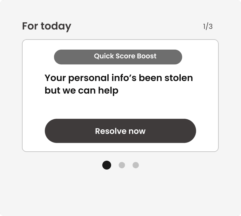
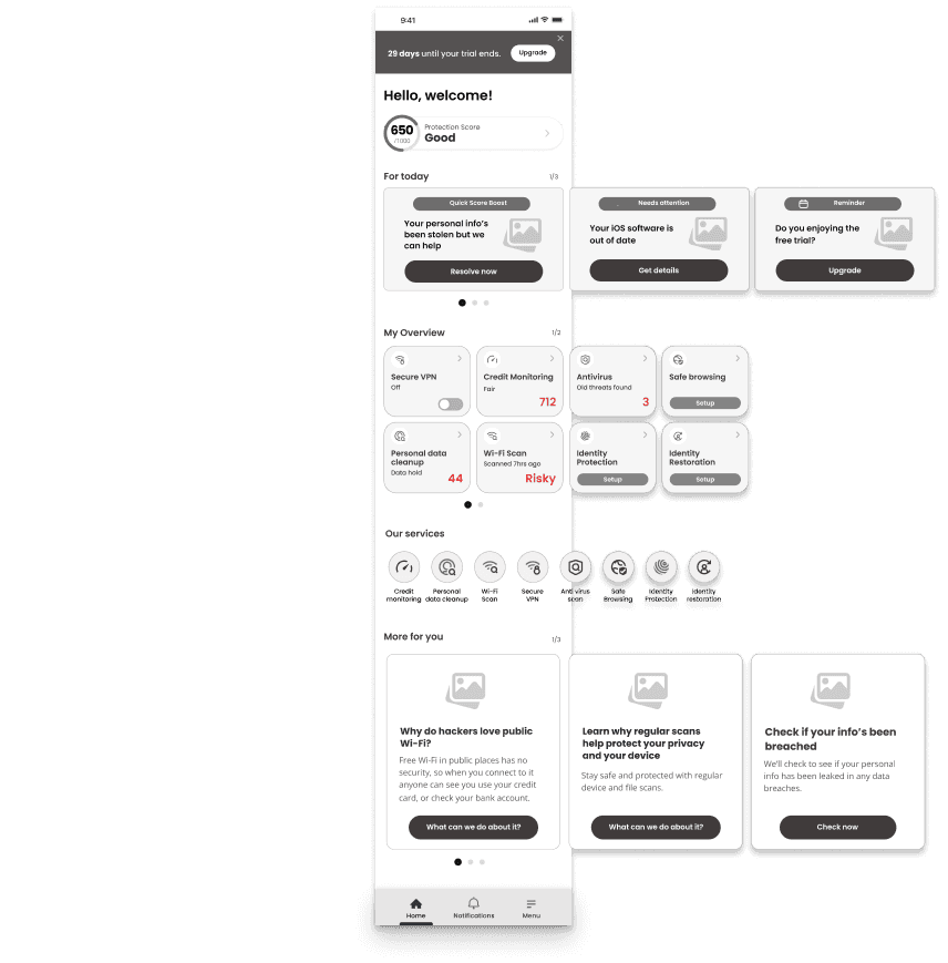
For today section
For today section
Participants easily recognized and clicked on tasks in the 'For Today' section of the wireframe.
Participants easily recognized and clicked on tasks in the 'For Today' section of the wireframe.
Struggled to notice the existence of subsequent cards despite the dot indicators.
Struggled to notice the existence of subsequent cards despite the dot indicators.
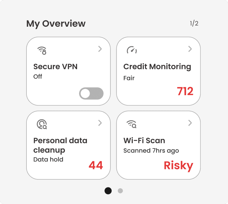
My Overview section
My Overview section
From the 'My Overview' section's feature list, participants understood the app's purpose and how it protects their Wi-Fi and personal data, enhancing their appreciation of its value.
From the 'My Overview' section's feature list, participants understood the app's purpose and how it protects their Wi-Fi and personal data, enhancing their appreciation of its value.
As with the 'For today' section, participants didn't easily realize that there were more features on the right side.
As with the 'For today' section, participants didn't easily realize that there were more features on the right side.
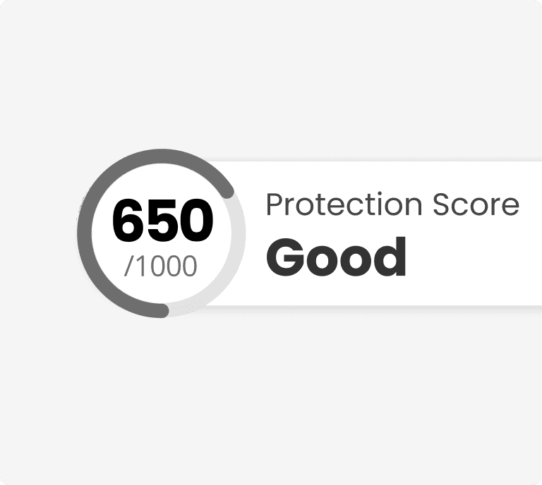
Protection score
Protection score
Most participants did not understand what the Protection Score was, leading them to ask questions about what it actually meant.
Most participants did not understand what the Protection Score was, leading them to ask questions about what it actually meant.
Key takeways
Key takeways
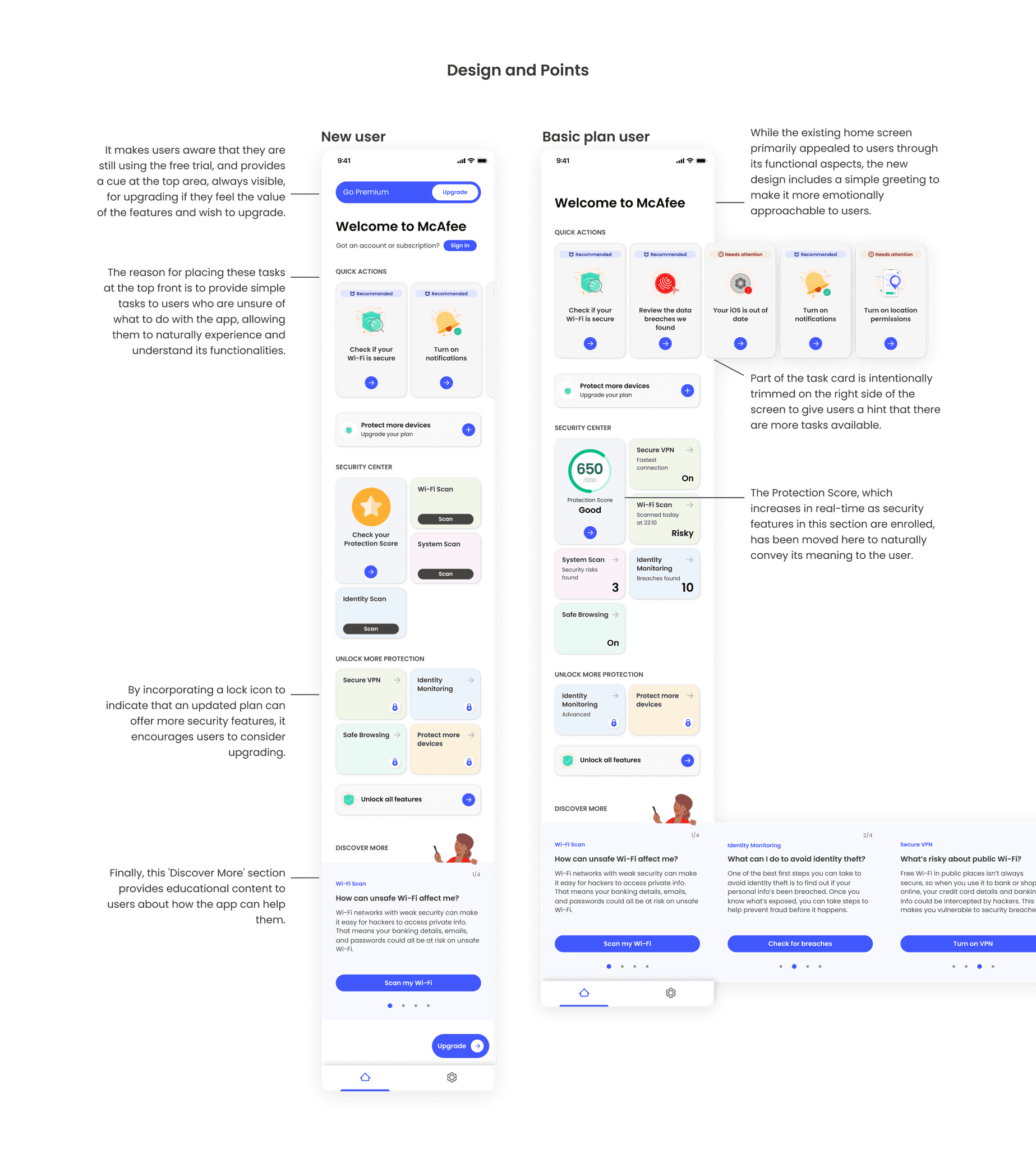
When the status of each security feature (for example, Safe, Risky, or the number of held data) was displayed alongside the feature's name, participants began to view both the function and status together. As a result, they thought that by using these features, they could monitor the security status of their personal information and Wi-Fi, and it seemed they assumed they could be better protected through the app.
When the status of each security feature (for example, Safe, Risky, or the number of held data) was displayed alongside the feature's name, participants began to view both the function and status together. As a result, they thought that by using these features, they could monitor the security status of their personal information and Wi-Fi, and it seemed they assumed they could be better protected through the app.
In the existing version, the tasks within the cards contained too many explanations. However, after changing them to concise, action-focused messages, users appeared to feel less burdened by the tasks themselves and were more actively engaged in completing them.
In the existing version, the tasks within the cards contained too many explanations. However, after changing them to concise, action-focused messages, users appeared to feel less burdened by the tasks themselves and were more actively engaged in completing them.
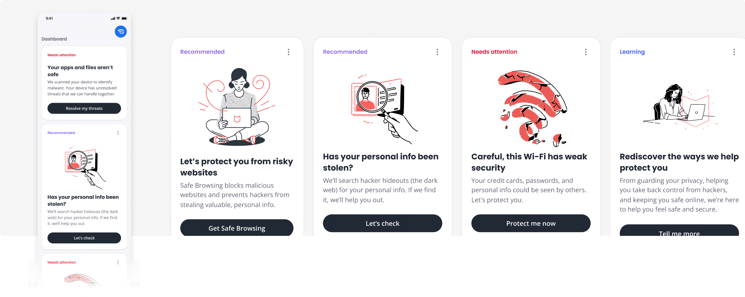
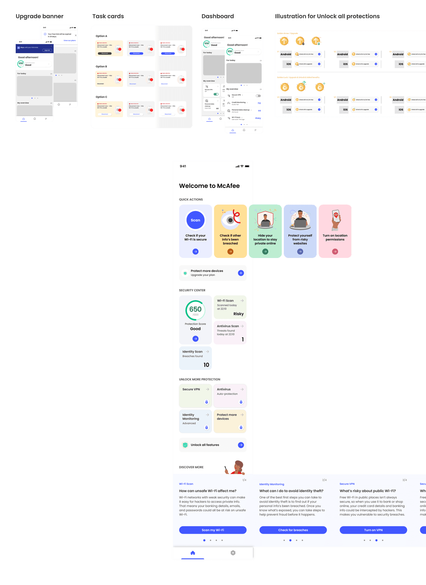
Visual Design Exploration (Also reflecting results from the above user research)
Visual Design Exploration
(Also reflecting results from the above user research)
Visual Design Exploration
(Also reflecting results from the above user research)
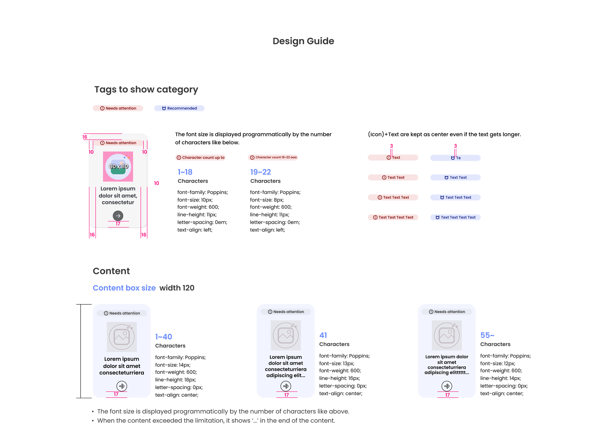
To maintain visual consistency with the McAfee brand, components and colors from the McAfee design library were utilized. The components that need to be newly added through the home screen redesign, which were not included previously, will be added to the component library after being tested and fixed as shown below.
To maintain visual consistency with the McAfee brand, components and colors from the McAfee design library were utilized. The components that need to be newly added through the home screen redesign, which were not included previously, will be added to the component library after being tested and fixed as shown below.
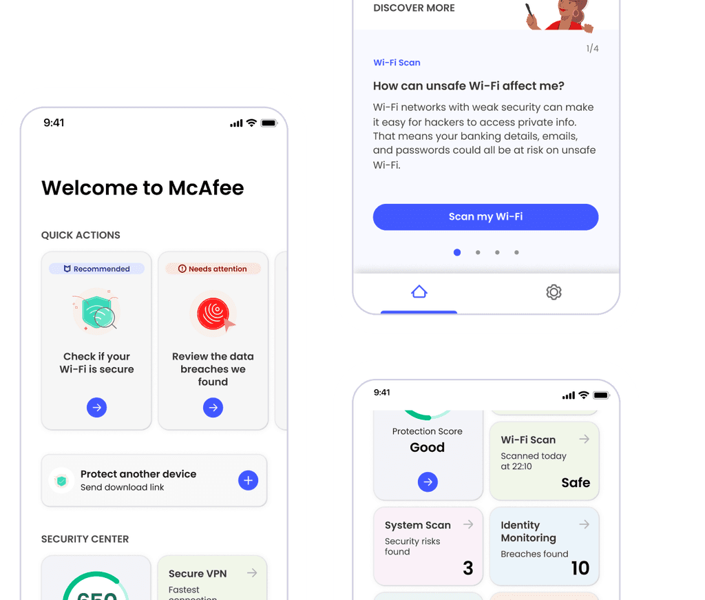
Final Design Deliverable
Final Design Deliverable
Final Design Deliverable
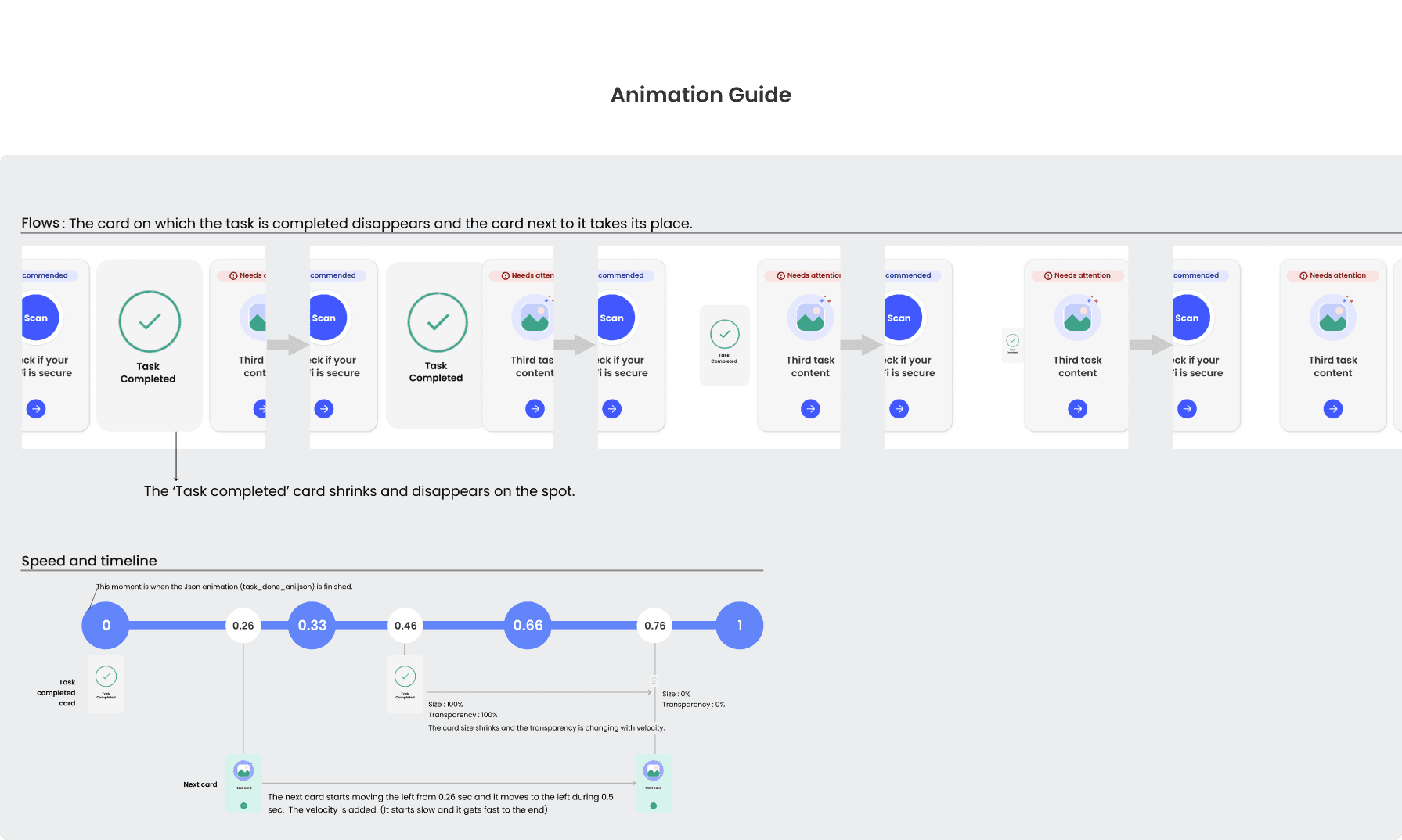
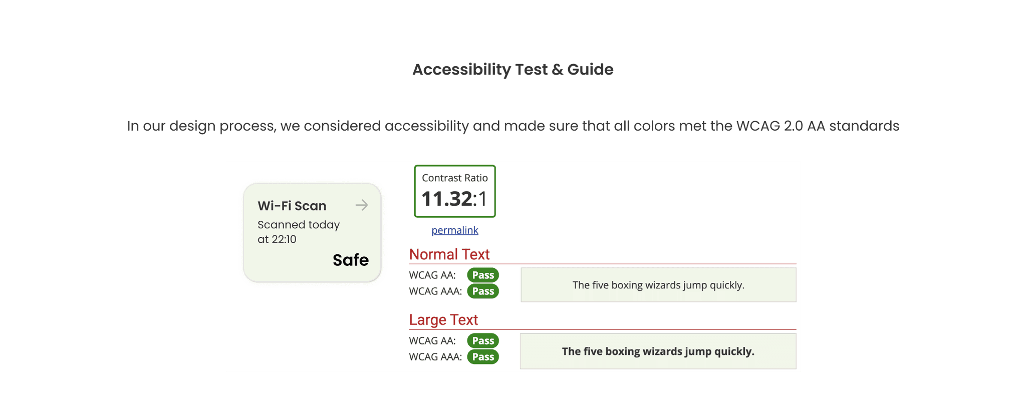
After several design revisions, the final design was completed and a detailed design implementation guide was delivered to the developers. This design was also checked for accessibility and delivered along with an accessibility guide for blind users.
After several design revisions, the final design was completed and a detailed design implementation guide was delivered to the developers. This design was also checked for accessibility and delivered along with an accessibility guide for blind users.


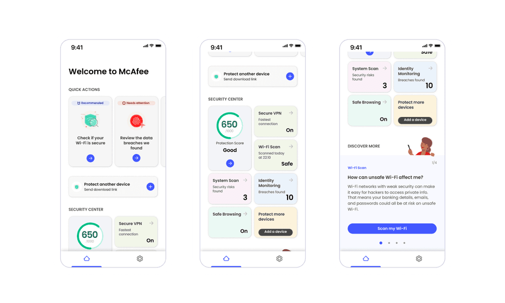
Design Implementation Review
Design Implementation Review
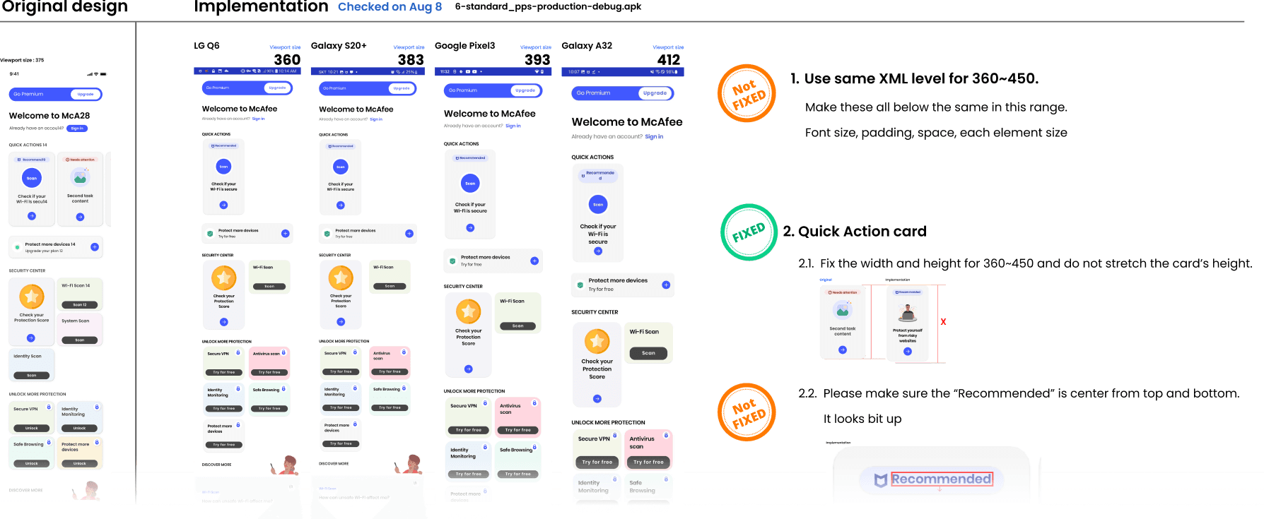
Design Implementation Review
This process allows app developers to implement the design and then review and correct any discrepancies by comparing it with the original design. It ensures that the final product faithfully represents the intended design.
This process allows app developers to implement the design and then review and correct any discrepancies by comparing it with the original design. It ensures that the final product faithfully represents the intended design.
Results and Lessons Learned
Results and Lessons Learned
Results and Lessons Learned
“There is a 30% increase in the conversion rate from free users to paid users.”
“There is a 30% increase in the conversion rate from free users to paid users.”
The main factors are that users are attracted to the feature through simple tasks, which increases the engagement level. Additionally, organizing the home screen by separating the task area and the information area is another factor.
The main factors are that users are attracted to the feature through simple tasks, which increases the engagement level. Additionally, organizing the home screen by separating the task area and the information area is another factor.